Blog UX Audit & Redesign
Optimizing the MUHC Foundation’s Blog for conversions and engagement
SKILLS: UX Design, Digital Marketing Strategy & Graphic Design
TIMELINE: 3 weeks
DELIVERABLES: High fidelity mockup, wireframes, best practices report
Background
Stories are powerful. At the McGill University Health Centre (MUHC), there are so many incredible stories from patients, donors, and staff. All have a common thread. They showcase how donations from our community fund cutting-edge research and life-saving care.
During a website review, a huge opportunity was identified to improve the existing blog template that houses these stories. Readers are spending time on them, but there is a gap with taking the next step to either keep reading or make a donation. Zeroing in on what can be improved to increase engagements and conversions and then developing a high fidelity prototype will be the focus of this case study.
Approach
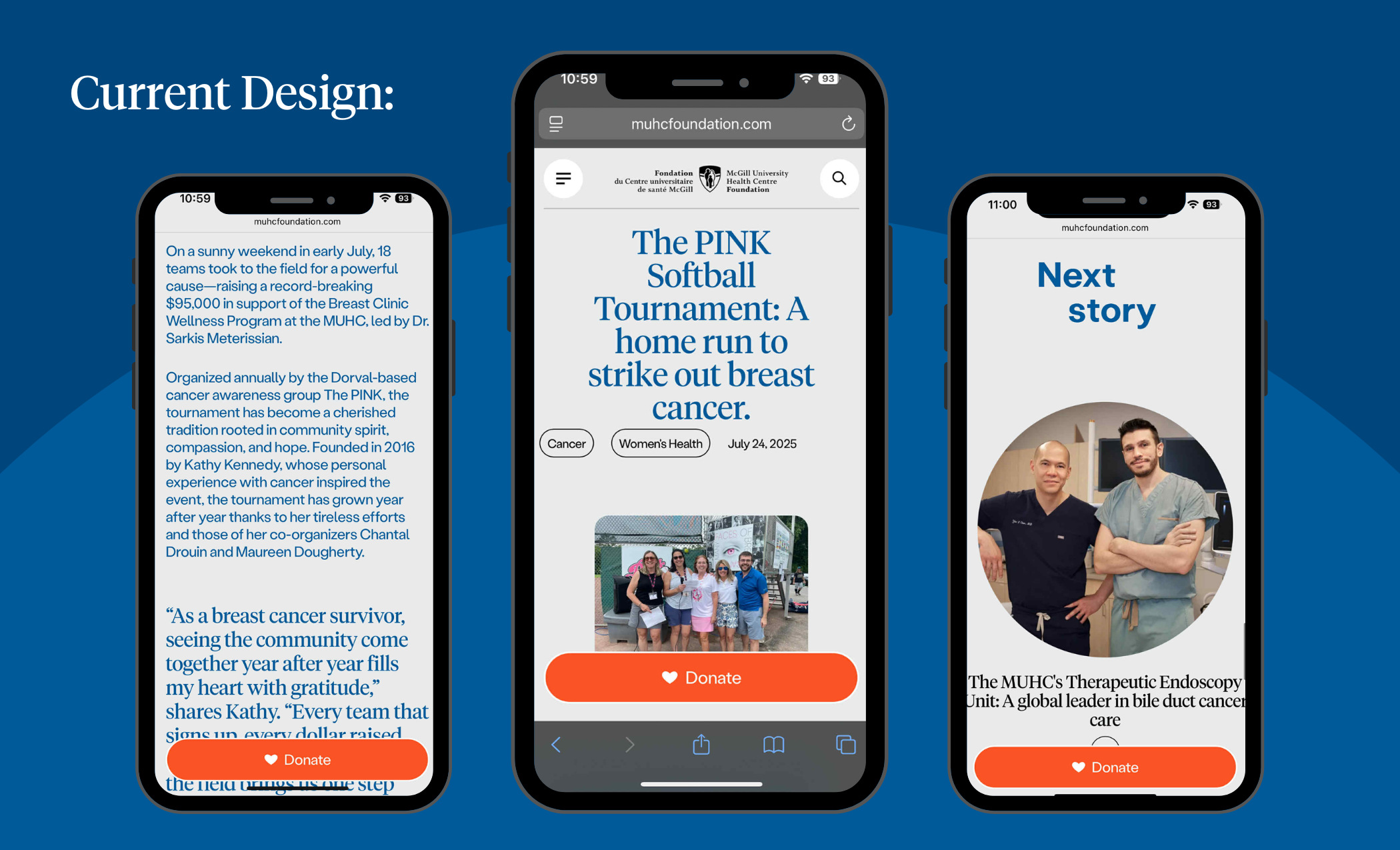
The existing template for the blog is relatively simple including a title, image, body text, photo gallery and related story CTA. Given that, there are some huge areas for improvement.
Copy
I broke up the long title into a stickier title and descriptive subtitle. I added subheadings throughout the body to break up the text and guide the eye for quick scanning. I also added descriptions underneath the photos which will also help with SEO. The lines of text are quite long and as a result take the readers a longer time to scan. I shortened the characters per line to 50-75 characters. I changed the background color to white and the text color to black to save color for emphasizing CTAs.
Creative Direction
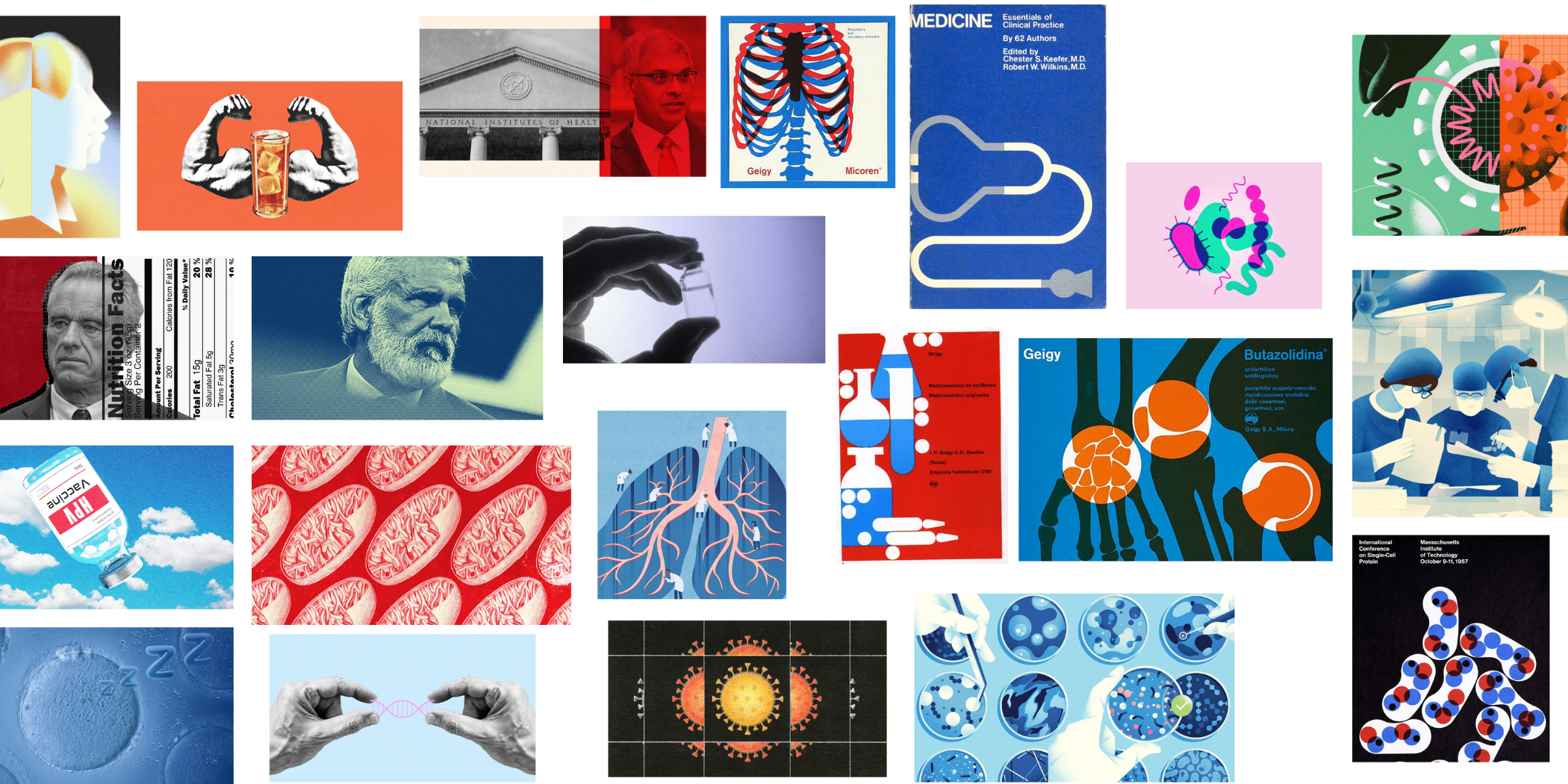
A common challenge encountered for assets is limited photographs to choose from for graphics because doctors and patients have limited availability to have their picture taken. I created a mood board with stylized graphics to account for this and have a more interesting look. Based on the mood board, cover images should have some combination of black and white photos, noise textures, bold color motifs, collage or repeating elements. Body content images will not be stylized but will add into the body to break up the text.
Blog Elements
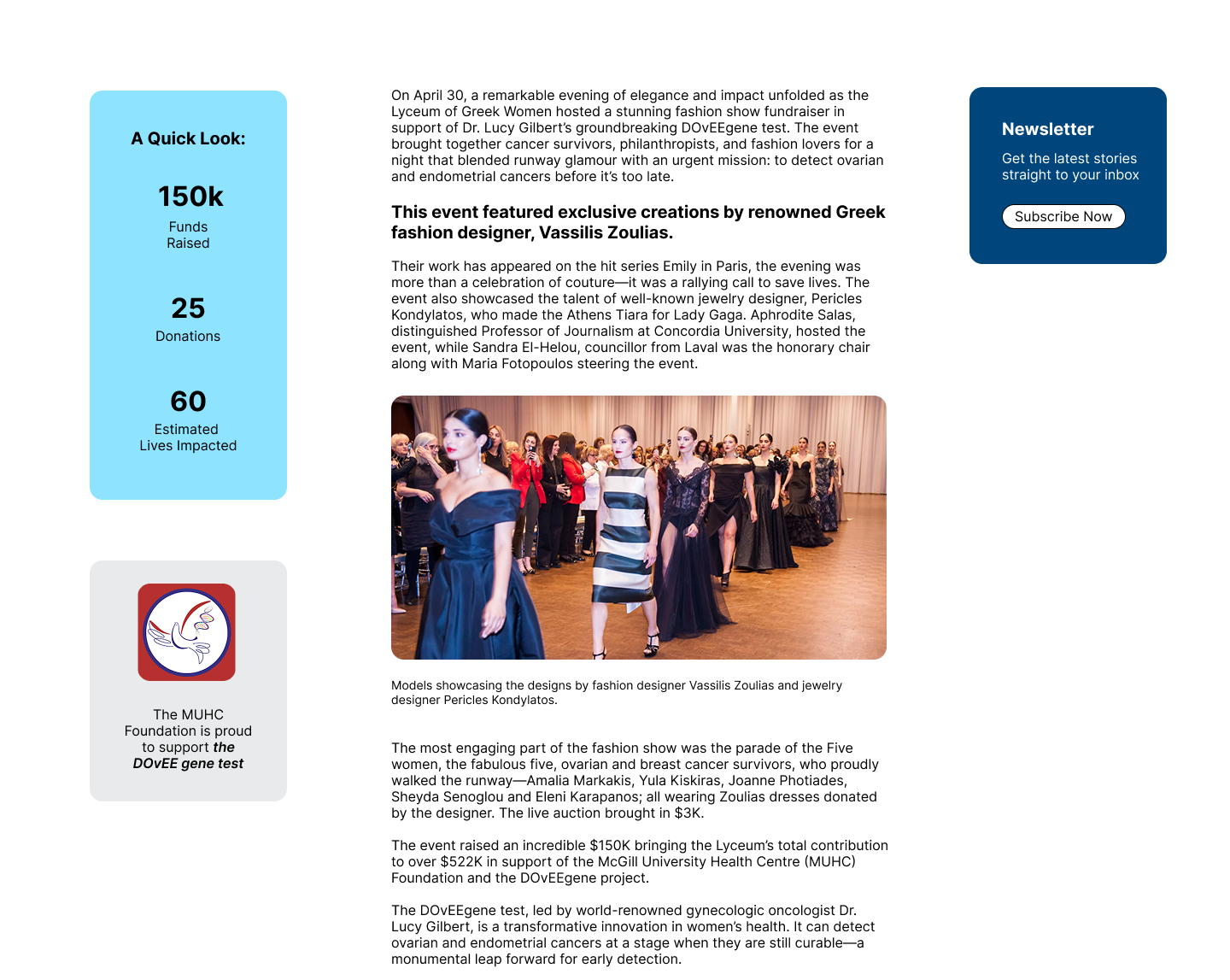
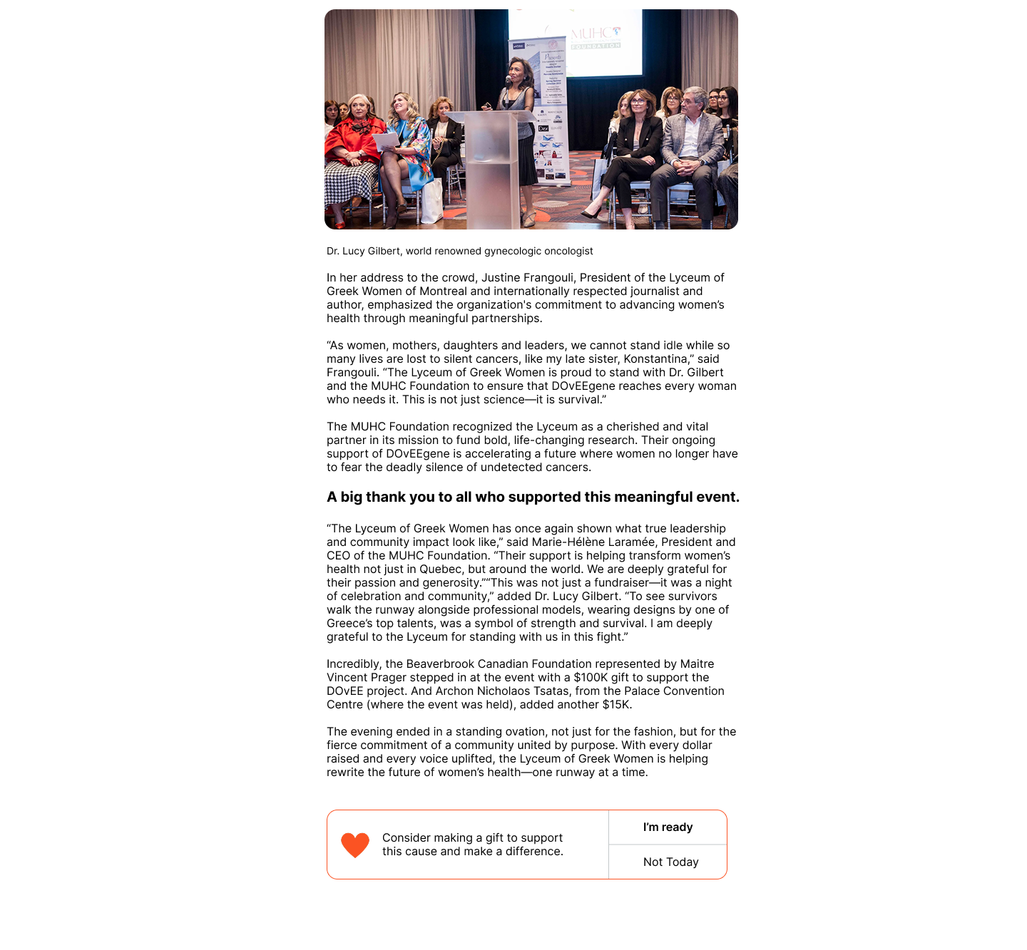
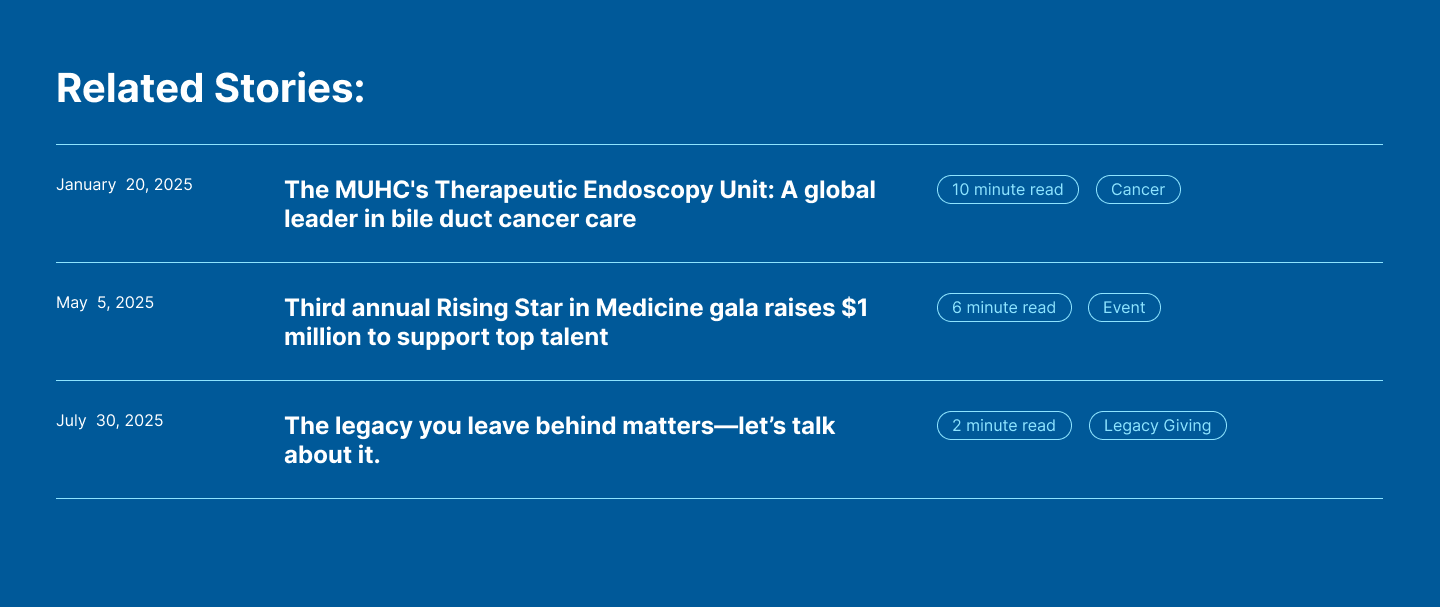
I added tags by topic and length of reading time (important for suggested related blogs and hyperlinks to relevant stories, research or external articles. I also added popups to the sides including a project summary with stats on donations, sponsor and gift match visibility, newsletter sign up, and targeted gift ask. I redesigned the related story section to suggest not just one story, but several with related tags to the current one.
Results
I created a wireframe to piece together my ideas and structure them. Then, I refined my design and made a higher fidelity mock up with an existing blog article.
Prototype
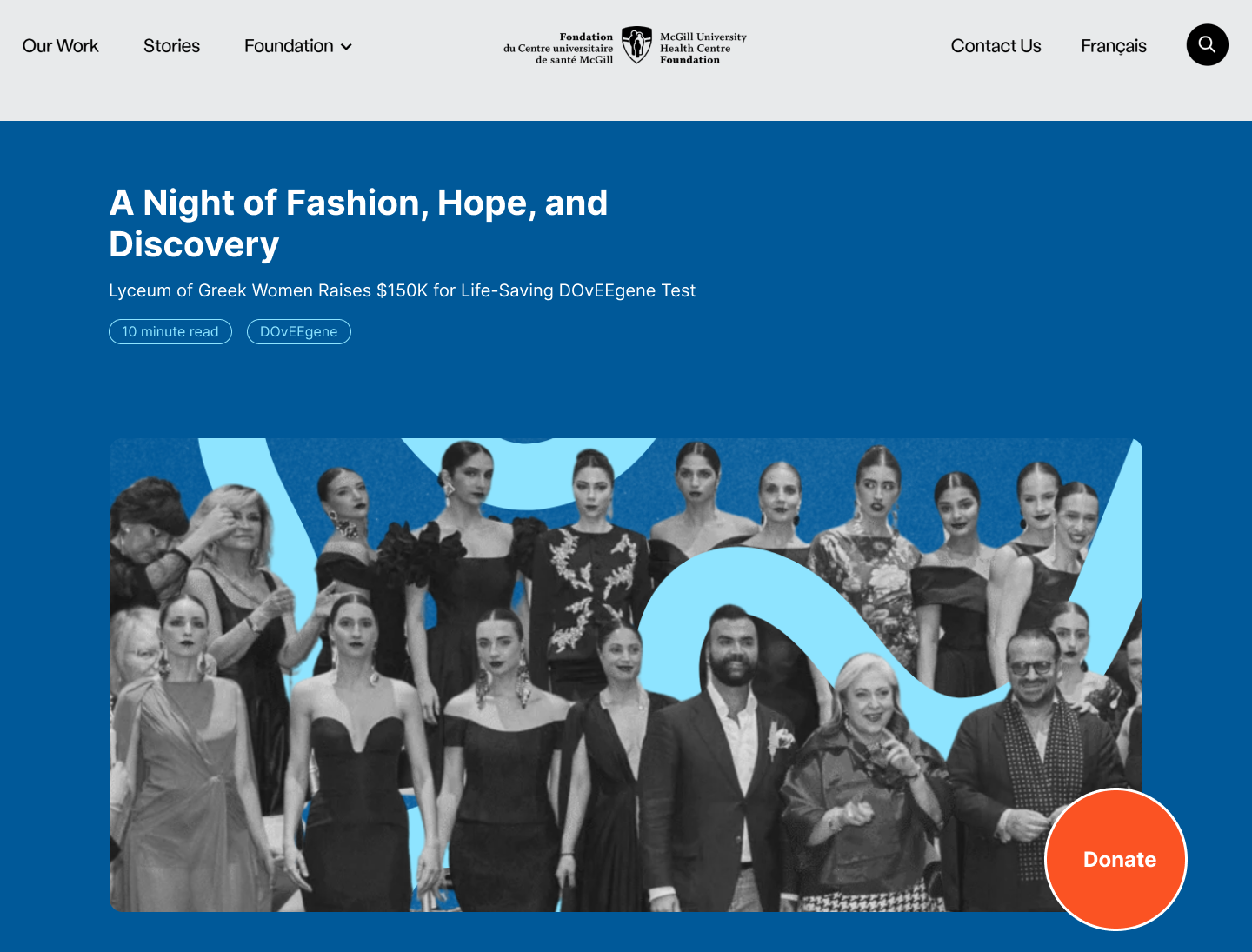
In the mock up below, I used an existing story to populate my prototype and applied the outlined approach to optimize it. The header used to have a much longer title which is now shorter and catchy with a more descriptive subtitle. I edited the photo to emphasize the fashion looks and add visual intrigue. I added a newsletter side bar, campaign summary, targeted ask module, and sponsorship shout out. The photo gallery is now gone and instead, I added the event photos throughout the body text with titles to break it up and guide the reader. After delivering this UX review of the blog, this project is currently in the development phases pending roll out.