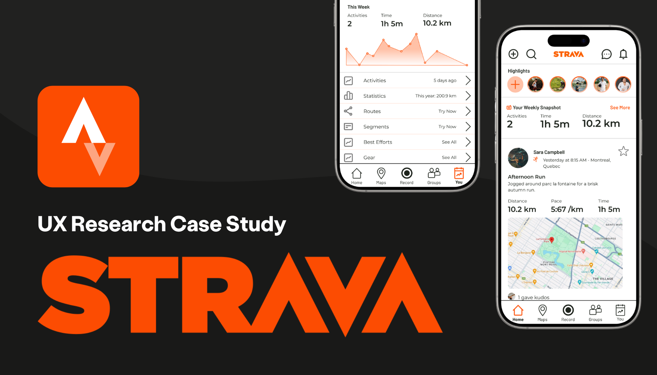
Strava App Redesign
Improving social features and navigation
ROLE: UX Researcher & UI Designer
TIMELINE: 5 weeks
DELIVERABLES: User Interviews, Empathy Map, Persona, Wireframes, Interactive Prototype
Project Overview
Strava is a fitness app mostly used to track runs, bike rides or other physical activity milestones. When I first started running and using Strava to track my runs, I wondered if I was the only one who had a hard time navigating the app. Is it just me? Let’s find out!
Problem Statement
Strava users find the app hard to navigate and digest content. In particular, users find it difficult to check their friends’ activity and view their own personal fitness data.
Goal
My goal for this project was to make activities and workout data easily accessible. My possible solutions for these objectives were redesigning the navigation, reordering the app architecture and adding features.
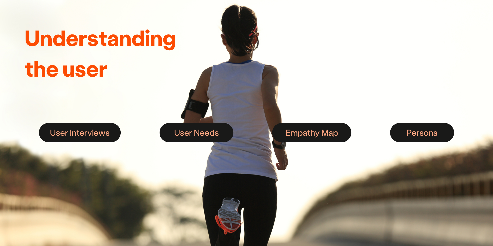
Research Methods
User Interviews
I conducted 4 user interviews across a variety of users (age, new vs. old users, activity type) with a semi structured script. I then reviewed common themes that came up to direct my solution.
-
Make your own workouts and data easier to find?
Foster connecting with friends and staying in the loop?
Decrease frustrations with navigation?
-
Stay connected with friends
Encourage yourself to stay active through social sharing, data-driven progress, and activity tracking motivations
Save time on scrolling and navigating with an easy-to-use interface
-
Declutter Activity Feed
Redesign App Map Navigation
Create features to concisely organize and visualize information

Defining the User
Pains
User confusion and frustration while trying to view their activities and workout data
Difficulty sorting through friends’ activity
Gains
User motivation to use the app by logging activity and feeling proud of milestones and accomplishments
Friendly competition and accountability by adding friends on Strava

To the Drawing Board
Ideation
I used the crazy 8 framework to ideate with quick mini sketches possible solutions. From there, I referenced the common themes from user interviews and started paper prototyping and wireframing my ideas.


What I did:
Activity Highlights
Added ability for users to feature their main activity of the day in a new section.
Favorite Star Visibility
Moved Favorites Star to activity cards instead of under the 3 dot menu so users can prioritize who they see first on their feed faster.
Friend Leaderboard
Replaced ‘dead space’ Active page with Friends page under Group tab and added new leaderboard feature.
Profile Page
Reorganized app map architecture and moved the profile page to the secondary top navigation bar. I also redesigned the profile page to reflect the new highlights feature.
High Fidelity Mockups
Interactive Prototype
Here are the high fidelity screens I developed to show how my solutions function as an interactive prototype.